
- Introduction
- Version Compatibility
- Installation
- Configuration
- Dashboard Overview
- How to View the Dashboard
- How to Create a Chart Widget
- How to Delete a Chart Widget
- How to Select the Chart Type While Adding a Chart
- How to Change the Chart Legend Position
- How to Show or Hide Data Labels
- How to Change the Chart Color
- How to Apply Global Issue Status Filter
- How to Apply Data Filters to a Chart
- How to Select the Global Date Range
- How to Set a Custom Date Range for a Single Chart
- How to Resize a Chart
- How to Drag and Drop a Chart
- How to Refresh Charts and Use Full-Screen Mode
- How to Enable Auto Refresh
- How to Search and Add Charts
- How to Add Saved Query Widgets
- How to Use Drill-Down from Charts to Issues
- How to Use Chart Information Tooltip
- How to Copy a Chart
- How to Update a Chart Title
- How to Set Global Date Range Across All Charts
- How to Share and Access a Public Dashboard
- Troubleshooting
- Frequently Asked Questions
- Uninstallation
- Conclusion
Introduction #
Redmineflux Analytics Dashboard is a modern, interactive analytics plugin for Redmine that brings project data together in one visual workspace. It lets teams track issue progress, time activity, team workload, and project health through a grid of customizable chart widgets.
The dashboard supports over 20 chart types across issues and time tracking. Charts can be filtered, resized, rearranged, and styled individually or globally.
Key capabilities include drag-and-drop layout management, per-chart custom date ranges, saved query widgets, public dashboard sharing via token-based links, drill-down to issue lists from chart segments, auto-refresh, and full-screen mode.
This plugin is designed to give project managers, team leads, and developers a faster and more flexible way to understand and act on project data.
Version Compatibility #
Supported Redmine versions:
- 4.0.x, 4.1.x, 4.2.x
- 5.0.x, 5.1.x
- 6.0.x (includes automatic YAML to JSON serialization migration)
Installation #
To install the Redmineflux Analytics Dashboard plugin:
- Make sure Redmine is already installed and working.
- Download the plugin archive from the Redmineflux website.
- Extract the plugin archive.
- Upload the extracted folder to Redmine/plugins/redmineflux_dashboard.
- Do not rename the plugin folder.
- Install required gems:
bundle install - Run database migrations.
For production:RAILS_ENV=production bundle exec rails redmine:plugins:migrateFor development:
RAILS_ENV=development bundle exec rails redmine:plugins:migrate - Restart Redmine.
Example:
bundle exec rails server
Note:
If you encounter any UI-related issues after installing the plugin, such as missing styles or JavaScript functionality (for example, CSS or JavaScript files not loading properly), run the following command and then restart your Redmine server:
RAILS_ENV=production bundle exec rake assets:precompile
This command regenerates the plugin assets and helps ensure that all CSS and JavaScript files are loaded correctly.
Configuration #
To access the Analytics Dashboard:
- Log in to Redmine.
- Open Administration and go to Settings.
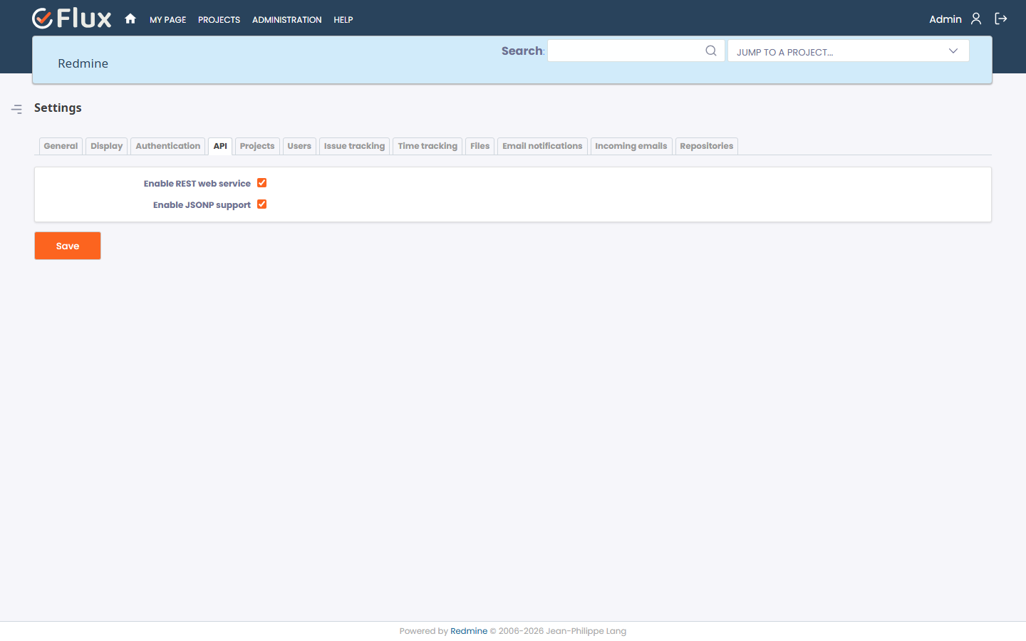
- Open the API tab.
- Enable REST API and save.
- Open any project from the project list.
- Click Dashboard from the project menu.
The Dashboard tab is available on all projects without needing to enable a project module. Any user with access to the project can open the dashboard.
There are no plugin-level configuration options. All dashboard settings are managed per project and per user from within the dashboard interface.
Dashboard Overview #
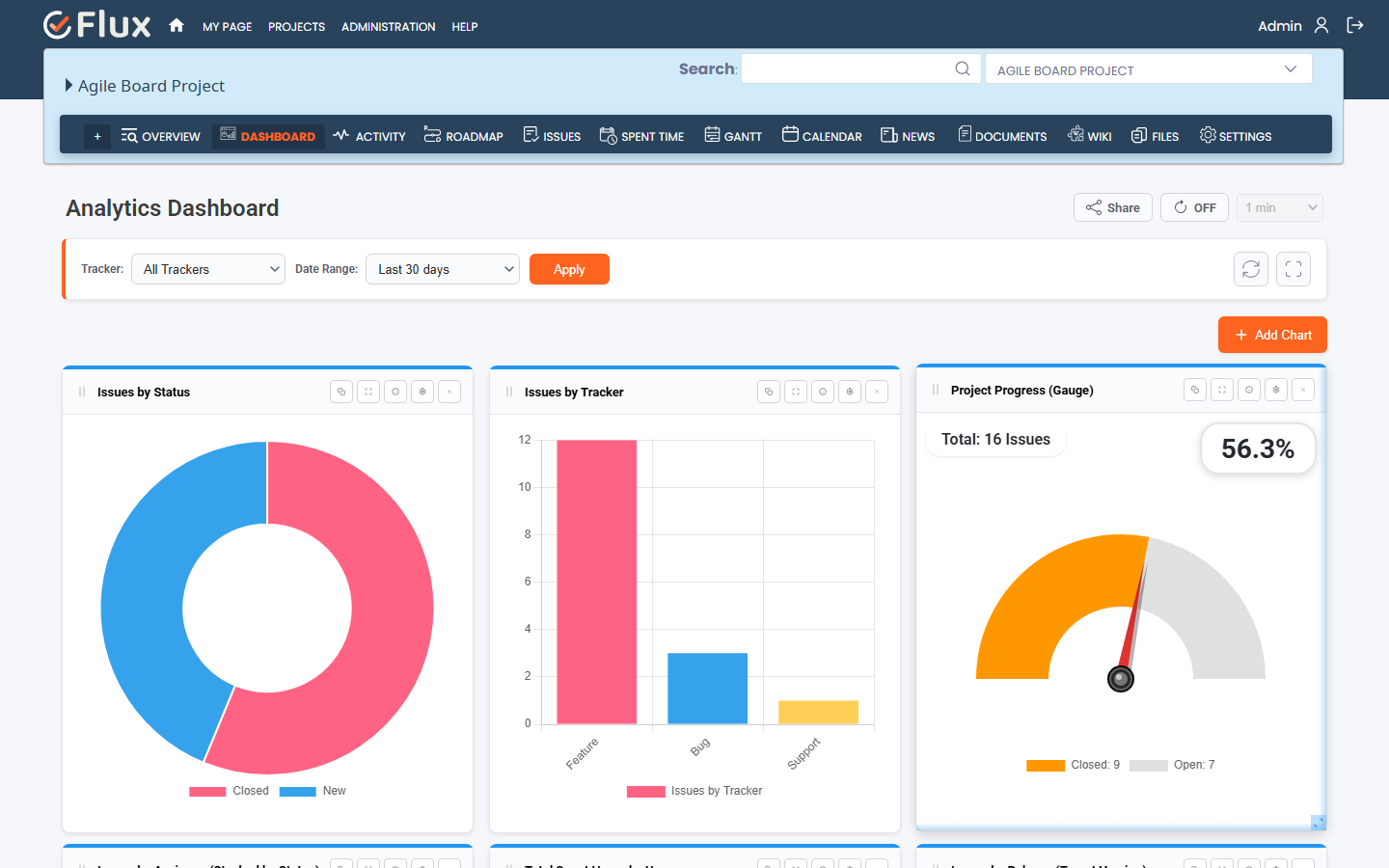
The Redmineflux Analytics Dashboard is organized around a flexible widget grid. Each widget on the grid is an individual chart that can be configured, positioned, and filtered independently.
The main dashboard interface includes:
- A header with the dashboard title and controls
- Global filters for Tracker, Date Range, and Issue Status
- Apply Filters, Refresh, and Full-Screen buttons
- An Add Chart button for adding new widgets
- A chart grid where widgets can be freely arranged
Each chart card includes:
- A chart rendered using ApexCharts
- A settings control for customizing chart options
- Refresh, full-screen, copy, and delete controls
- An info tooltip showing chart context
Main capabilities include:
- Over 20 chart types covering issues and time tracking
- Saved query widgets for issue and time entry queries
- Global and per-chart date range filtering
- Global issue status filter (all, open, closed)
- Per-chart data filters for status, tracker, priority, assignee, version, user, activity, and role
- Drag-and-drop layout management
- Resizable chart widgets
- Chart color and style customization
- Auto-refresh with configurable intervals
- Drill-down from chart segments to issue lists
- Token-based public dashboard sharing
How to View the Dashboard #
To view the dashboard for a project:
- Open the project.
- Click Dashboard from the project menu.
The dashboard opens and loads the saved widget layout for that project. If no widgets have been added yet, the grid is empty and the Add Chart button is available to start building the dashboard.
How to Create a Chart Widget #
To add a new chart to the dashboard:
- Open the project Dashboard.
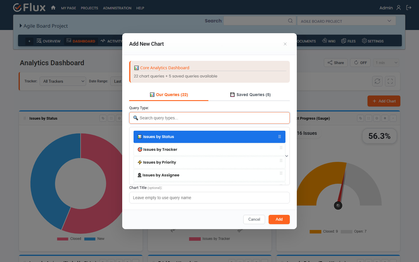
- Click the Add Chart button.
- The Add Chart modal opens.
- Select the Our Queries tab to choose from available chart types.
- Browse or search for the chart type you want.
- Optionally enter a custom title for the chart.
- Click Add.
- The chart widget is added to the dashboard grid and loads data using the current global date range and tracker filter.
Note:
- Chart type is selected at creation time. To use a different chart type later, add a new widget with the desired type and remove the old one.
- If no data is available for the selected filters, the chart displays an empty state.
How to Delete a Chart Widget #
To remove a chart from the dashboard:
- Open the dashboard.
- Find the chart you want to remove.
- Click the remove icon on the chart card.
- Confirm the deletion when prompted.
- The widget is removed from the dashboard grid.
How to Select the Chart Type While Adding a Chart #
The chart type determines what data is shown and how it is visualized.
To choose a chart type:
- Click Add Chart to open the modal.
- Open the Our Queries tab.
- Browse the list of available chart types.
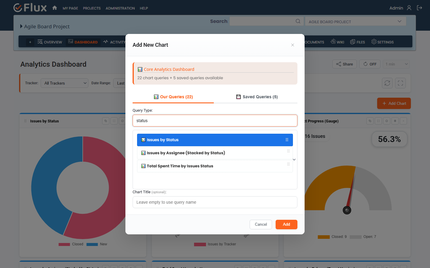
- Use the search field to filter by name if needed.
- Select the chart type you want.
- Click Add to create the widget.
Core chart types available in all installations:
- Issues by Status
- Issues by Tracker
- Issues by Priority
- Issues by Assignee
- Issues by Assignee (Stacked by Status)
- Issues by Assignee (Stacked by Tracker)
- Issues by Assignee (Stacked by Priority)
- Issues by Version
- Issues by Percentage Done
- Issues Trend (Open vs Closed)
- User Activity
- Total Spent Hours by Users
- Total Spent Hours by Activity
- Total Spent Time by Tracker
- Total Spent Time by Status
- Total Spent Time by Version
- Estimated vs Spent Time by User
- Estimated vs Spent Time by Version
- Total Spent Time by Role
- Total Remaining Time by Assignee
- Total Remaining Time by Tracker
- Project Progress Gauge
- Saved Query
How to Change the Chart Legend Position #
To change where the legend appears on a chart:
- Open the chart settings by clicking the settings icon on the chart card.
- Go to the General section.
- Find the Legend Position option.
- Select Top, Bottom, Left, or Right.
- Save the settings.
- The chart updates immediately with the new legend position.
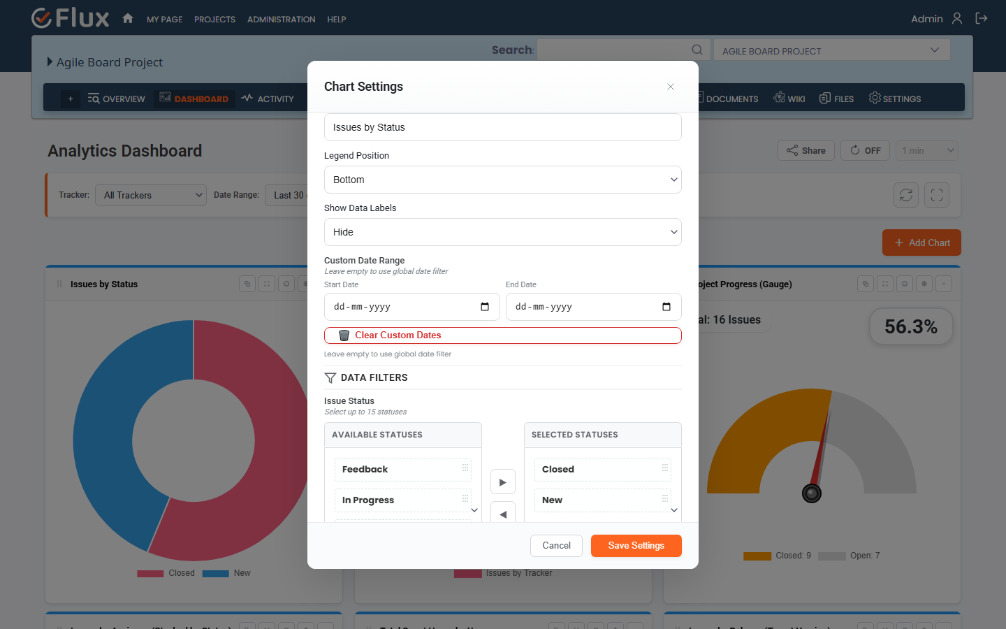
How to Show or Hide Data Labels #
To control whether values are shown directly on the chart:
- Open the chart settings.
- Go to the General section.
- Find the Show Data Labels option.
- Select Show to display values on the chart, or Hide to remove them.
- Save the settings.
- The chart updates with the selected label display.
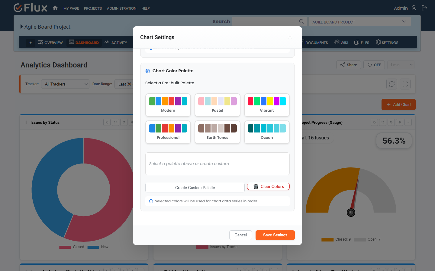
How to Change the Chart Color #
To customize chart colors and card styling:
- Open the chart settings.
- Go to the Appearance section.
- Set the Top Accent Color to change the card header border color.
- Choose a prebuilt color palette or set individual custom chart colors.
- Optionally set the background color and border color for the chart card.
- Save the settings.
- The chart updates with the new styling.
Color customization helps you organize charts visually and match your team or project style.
How to Apply Global Issue Status Filter #
The global issue status filter applies to all charts on the dashboard at once.
To set the issue status filter:
- Open the dashboard.
- Find the Issue Status control in the top filter bar.
- Select one of the available options:
- All Issues
- Open Issues Only
- Closed Issues Only
- Click Apply Filters.
- All charts refresh and display data matching the selected status.
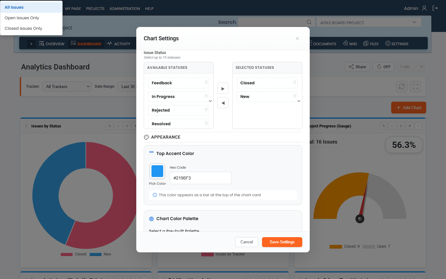
How to Apply Data Filters to a Chart #
Each chart can be filtered independently to show only specific data segments.
To apply data filters to a single chart:
- Open the chart settings by clicking the settings icon on the chart card.
- Go to the Data Filters section.
- The available filter options depend on the chart type and may include:
- Issue Status
- Tracker
- Priority
- Assignee
- Version
- Activity
- Role
- User
- Move values from the available list to the selected list for each filter you want to apply.
- Save the settings.
- The chart redraws using the selected filter values.
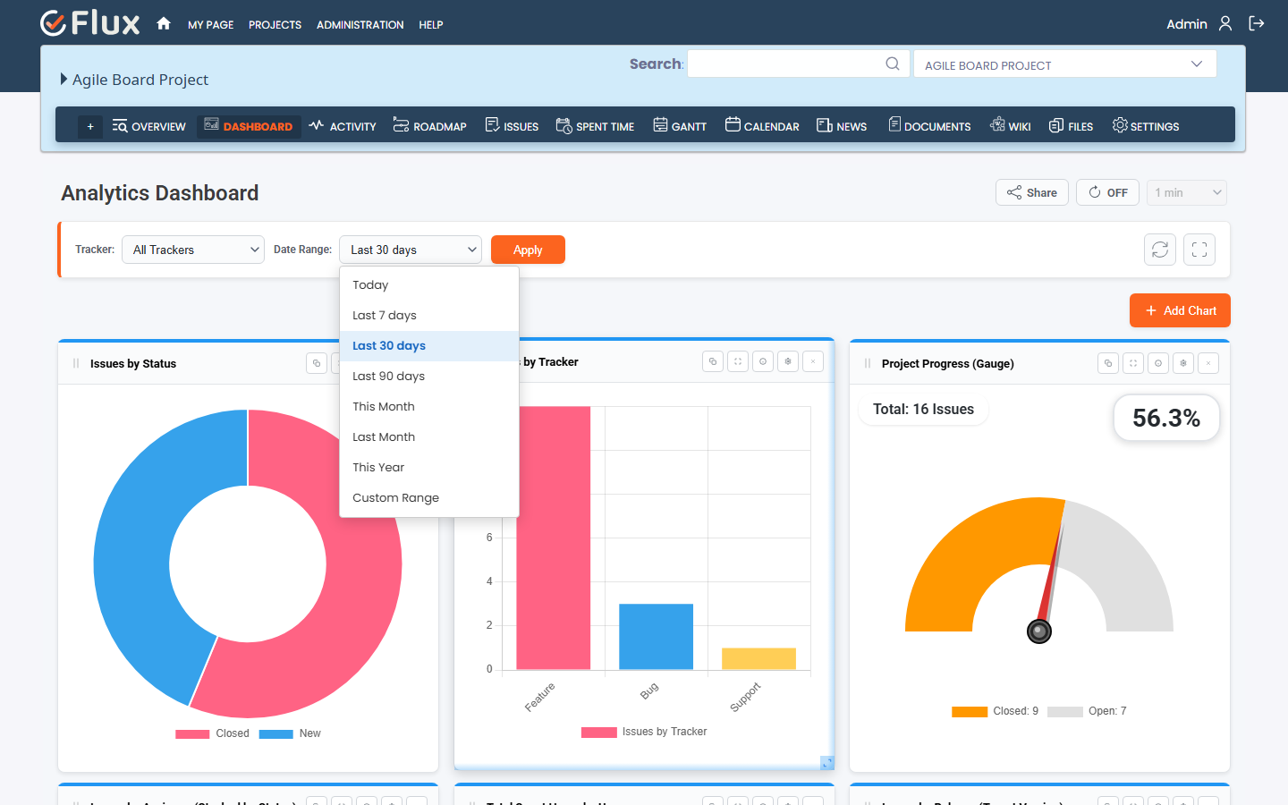
How to Select the Global Date Range #
The global date range applies to all charts on the dashboard unless a chart has its own custom date range set.
To set the global date range:
- Use the Date Range selector in the top dashboard filter bar.
- Choose a preset range:
- Today
- Last 7 Days
- Last 30 Days
- Last 90 Days
- This Month
- Last Month
- This Year
- For a custom range, select Custom and enter a Start Date and End Date.
- Click Apply Filters.
- All charts without a per-chart custom date range update to the selected period.
The dashboard remembers your last used date range and reapplies it on the next load.
How to Set a Custom Date Range for a Single Chart #
A chart can use its own date range independently of the global filter.
To set a per-chart date range:
- Open the chart settings.
- Go to the General section.
- Set a Custom Start Date and Custom End Date for the chart.
- Save the settings.
- That chart now shows data for its own date range even when the global filter changes.
To return a chart to the global date range behavior:
- Open the chart settings.
- Clear the Custom Start Date and Custom End Date fields.
- Save the settings.
How to Resize a Chart #
To change the size of a chart widget:
- Open the dashboard with your widgets visible.
- Locate the resize handle on the right edge, bottom edge, or corner of the chart card.
- Click and drag the handle to adjust the width and height.
- Release to set the new dimensions.
- The new size is saved automatically.
How to Drag and Drop a Chart #
To rearrange the position of a chart on the dashboard:
- Open the dashboard.
- Click and hold the chart card header drag area.
- Drag the card to the desired position on the grid.
- Release to drop the chart into the new location.
- The new position is saved automatically.
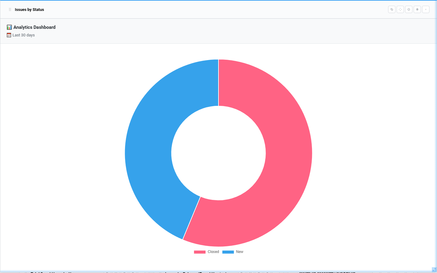
How to Refresh Charts and Use Full-Screen Mode #
To manually refresh all charts on the dashboard:
- Click the Refresh button in the dashboard filter bar.
- All widgets reload their data from the server.
To view the full dashboard in full-screen mode:
- Click the Fullscreen icon in the dashboard toolbar.
- The dashboard expands to fill the full browser window.
- Exit full-screen by pressing Escape or clicking the toggle icon again.
To view a single chart in full-screen mode:
- Click the full-screen button on the individual chart card.
- That chart expands to a full-screen view.
- The full-screen view includes date and tracker context information.
- Exit using Escape or the toggle icon.
How to Enable Auto Refresh #
Auto refresh keeps the dashboard up to date without manual action.
To enable auto refresh:
- Find the Auto Refresh control in the dashboard header.
- Turn it on.
- Select a refresh interval:
- 30 seconds
- 1 minute
- 2 minutes
- 5 minutes
- 10 minutes
- A countdown indicator shows when the next refresh will occur.
- The dashboard continues to auto-update at the selected interval.
Auto refresh is also available in the public dashboard view.
How to Search and Add Charts #
To search for a specific chart type when adding a widget:
- Click Add Chart to open the modal.
- In the Our Queries tab, use the search input field.
- Enter a keyword from the chart type name.
- The list filters to show matching chart types.
- Select the result you want.
- Optionally enter a title.
- Click Add.
To search saved queries:
- Switch to the Saved Queries tab in the Add Chart modal.
- Use the search input to filter by query name.
- Select the query and add the widget.
How to Add Saved Query Widgets #
Saved query widgets let you display data from existing Redmine issue or time entry queries directly on the dashboard.
To add a saved query widget:
- Click Add Chart to open the modal.
- Switch to the Saved Queries tab.
- Choose whether you want an Issue Query or a Time Entry Query.
- Find and select the saved query you want to display.
- Optionally enter a custom title, or keep the query name as the title.
- Click Add.
- The widget appears on the dashboard showing statistics from that saved query.
Note:
- Saved query widgets respect the visibility and permission rules of the original query.
- If a query is not visible to the current user, its data will not be shown.
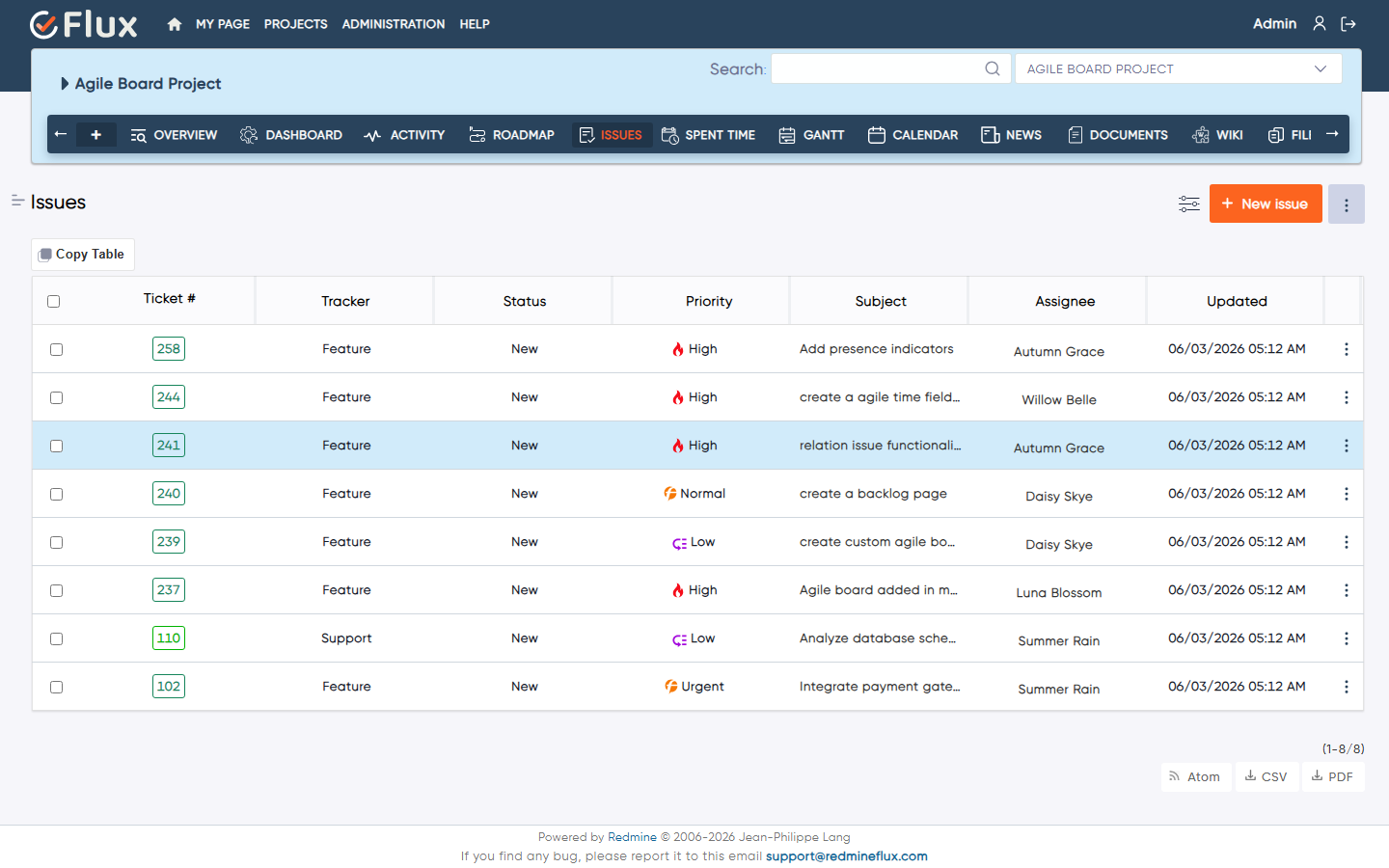
How to Use Drill-Down from Charts to Issues #
Drill-down lets you click on a chart segment to see the individual issues that make up that data point.
To use drill-down:
- Click on a data point, bar, or segment on a supported chart.
- The dashboard opens an issue list panel showing the exact issues behind that segment.
- The drill-down respects the active date range and chart filters.
- Review the issues to investigate the underlying data.
This feature is useful for going from a summary view to the specific issues that need attention.
How to Use Chart Information Tooltip #
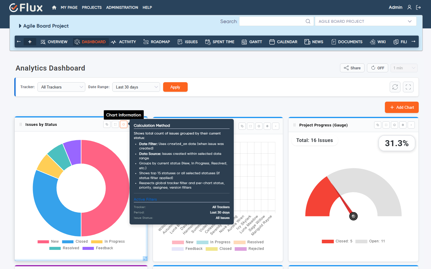
Each chart card has an info icon that shows context about that chart.
To view chart information:
- Click the info icon on the chart card.
- A tooltip or popover appears showing chart context and metadata.
- In full-screen mode, the context includes the active date range and selected tracker information.
How to Copy a Chart #
To duplicate a chart for reuse:
- Click the copy icon in the chart card controls.
- The plugin clones the chart widget.
- The copied chart appears on the dashboard and can be configured independently.
This is useful for creating variations of the same chart with different filters or date ranges.
How to Update a Chart Title #
To change the display title of a chart:
- Open the chart settings by clicking the settings icon on the chart card.
- Find the Chart Title field.
- Edit the title text.
- Save the settings.
- The updated title appears immediately on the chart card.
How to Set Global Date Range Across All Charts #
The global date range selector at the top of the dashboard controls all charts that do not have a per-chart custom date range set.
To update the global date range:
- Use the Date Range dropdown in the top filter bar.
- Select a preset or choose custom dates.
- Click Apply Filters.
- All charts without individual date overrides update to the selected range.
- The dashboard saves your preference and reuses it in future loads.
How to Share and Access a Public Dashboard #
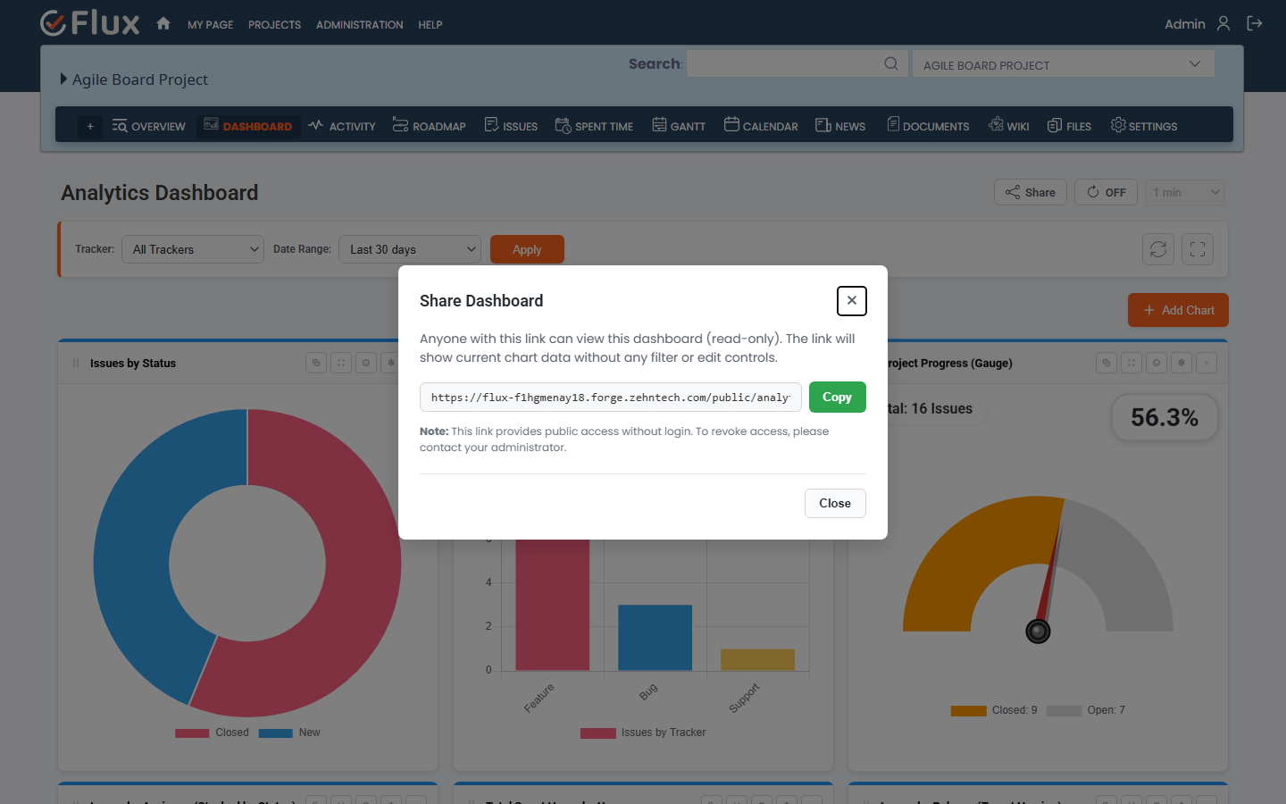
The public dashboard sharing feature generates a token-based URL that allows anyone to view the dashboard without logging in to Redmine.
To generate and share a public link:
- Open the dashboard.
- Click the Share button from the dashboard header.
- The system generates a unique public token and URL.
- Copy the URL from the modal.
- Share the URL with stakeholders, clients, or anyone who needs view access.
The public dashboard:
- Opens in a read-only view with no authentication required
- Shows the same layout and chart data as the saved dashboard
- Hides edit controls, filter inputs, and settings
- Supports auto-refresh so viewers always see current data
- Applies saved dashboard preferences and per-chart custom dates
- Returns a not found response if the token is invalid or has been revoked
To revoke public access, regenerate the token from the Share dialog. The previous link will stop working immediately.
Troubleshooting #
If you face issues with the plugin, try the following:
- Clear the browser cache and reload the page.
- Restart the Redmine application.
- Make sure the plugin is installed in plugins/redmineflux_dashboard and the folder name is unchanged.
- Re-run plugin migrations after installing or upgrading:
bundle exec rails redmine:plugins:migrate RAILS_ENV=production - Make sure the Redmine REST API is enabled in Administration > Settings > API.
- Confirm the Redmine version is supported (4.0.x through 6.0.x).
- If a saved query widget shows no data, check that the query is visible to the current user and has matching results.
- If a public link returns a not found error, regenerate the token from the Share dialog and share the new URL.
- If charts appear outdated, trigger a manual refresh or enable auto-refresh.
- If upgrading to Redmine 6, re-run migrations to complete the YAML to JSON serialization migration for saved settings.
- Review Redmine logs for plugin load or controller errors if charts fail to render.
Frequently Asked Questions #
Q1. What chart types does the dashboard include?
The dashboard includes over 20 chart types covering issues and time tracking, including issue breakdowns, time tracking summaries, trend analysis, and a Project Progress Gauge.
Q2. Can I customize the colors and appearance of charts?
Yes. You can change the top accent color, chart color palette, background color, border color, legend position, and data label visibility from each chart’s settings panel.
Q3. Can I apply one date range to all charts and a different range to one chart?
Yes. The global date range applies to all charts by default. You can set a per-chart custom start and end date to override the global range for that chart only.
Q4. Can I share the dashboard without giving Redmine account access?
Yes. Use the Share button to generate a token-based public URL. Anyone with the link can view the dashboard in read-only mode without logging in.
Q5. Can I add saved Redmine queries as widgets?
Yes. Both issue queries and time entry queries can be added as dashboard widgets from the Saved Queries tab in the Add Chart modal.
Q6. Does the dashboard support a Project Progress Gauge?
Yes. Project Progress Gauge is included as a core chart type available to all installations.
Q7. Can I change the chart type of an existing widget?
No. Chart type is selected when the widget is created. To use a different chart type, add a new widget with the desired type and remove the old one if it is no longer needed.
Q8. What filter options are available per chart?
Charts support dynamic data filters including issue status, tracker, priority, assignee, version, activity, role, and user. The filters available depend on the chart type.
Q9. Can I reorder and resize widgets on the dashboard?
Yes. Drag-and-drop repositioning and resize handles are fully supported. Layout changes are saved automatically.
Q10. Is auto-refresh available?
Yes. Auto-refresh can be enabled with intervals of 30 seconds, 1 minute, 2 minutes, 5 minutes, or 10 minutes. It is available in both the authenticated dashboard and the public view.
Q11. Does the dashboard work with Redmine 6?
Yes. The plugin supports Redmine 6.x and includes automatic migration logic to convert YAML serialized settings to JSON format as required by Redmine 6.
Uninstallation #
To uninstall the plugin:
- Go to the Redmine installation directory.
- Remove the plugin folder: plugins/redmineflux_dashboard.
- If you want to roll back database changes, run:
bundle exec rake redmine:plugins:migrate NAME=redmineflux_dashboard VERSION=0 RAILS_ENV=production - Restart Redmine.
Take a database backup before rolling back or uninstalling.
Conclusion #
Redmineflux Analytics Dashboard is a comprehensive analytics and reporting plugin for Redmine that brings issue tracking, time data, and project health into a single interactive workspace. It supports over 20 chart types, saved query widgets, per-chart and global filtering, drag-and-drop layout management, public dashboard sharing, auto-refresh, and drill-down to issue details.
The dashboard is designed to give project managers, team leads, and developers fast, clear, and flexible access to the data they need to make better project decisions.


